Design Critique; Bane NOR
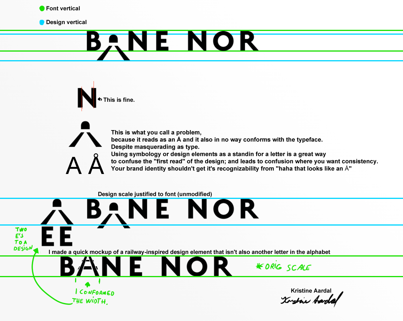
I’ve walked past the railway a few times of late; and this design has stuck out to me like a sore thumb.
I’d imagine the tunnel “A” design was someone’s labour of passion, and they wanted to avoid a pure font logo; but it works counter to it’s purpose and confuses readings.